Doable
WEB PROTOTYPE↗
TIMELINE
Spring 2022 / 15 weeks
ROLE
Ideation, interaction and experience design, prototyping, illustration
Overview & Problem
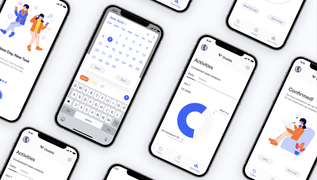
This is an app that would help the user from getting rid of procrastination and focus on their to-do list. Nowadays, more and more people are addicted to social media, my goal is to make people finish their task of the day first then enjoy their free time after.
PROCESS
Research
Design & ideation
Usability testing
High-Fidelity Designs
Learnings & Next Steps
01. Competitor Research
Initial Research
Procrastination: A survey shows that social media takes time from studying and projects the most.
The Problem: The study shows that 51 percent of students admit to losing at least an hour of productivity a day to social media and internet distraction. About 44 percent of those polled were worried about the overall quality of their work decreasing due to procrastination caused by the internet.
Competitor Research:
1. Todoist
In Todoist, you can put new tasks in your Inbox and then move them to relevant projects; you can also set due dates.
There are a lot of interesting features in it. I do think the date can remind the users of the due date and the priority level features would give the users a sense of the importance of each task, in that case, it is easier for them to manage the tasks.
Pro: Balancing power and simplicity.
2. Reminder (IOS)
In IOS's reminder, the users can tap the quick toolbar to easily add alerts for dates, times, and locations, or add a flag or attachment to your reminder. This app is super fast and easy to use.
In general, the UI/UX is doing a great job here.
Pro: Simple UI and make your tasks easier to manage
Based off my competitor research, I would like to add a due date and a priority flag feature into my update.
My Goals:
By using this app, user can ––
Increase productivity
Provide motivation
Reduce stress
Allow for more personal time
Reduce anxiety and improves mental health
Provide a sense of accomplishment
Reduce the time on social media
Affinity Mapping
Meta Insights #2
Meta Insights #1
How might we use social media in a positive way?
02. Design & ideation
How might we spend less time on social medias?
Sketches
At the very beginning of the prototype, I sketched out possible solutions with my peers.
Low Fidelity Design
Main Takeaways:
Think about what is the right flow between the to-do list and the channels
Is the timer for all the social media or just one at each time?
Change the time alert from the pop-up window to the notification banner
Make an add task button on the task page
Mid Fidelity Design
Main Takeaways:
The timers for the social media are too many, one is enough and make it into a single page instead
Get rid of the focus time because the IOS has it already
Make some onboarding pages to give users a sense of what this app does
Move the add task button to the top
Key Insights
03. Usability Testing
System Map
Usability Testing
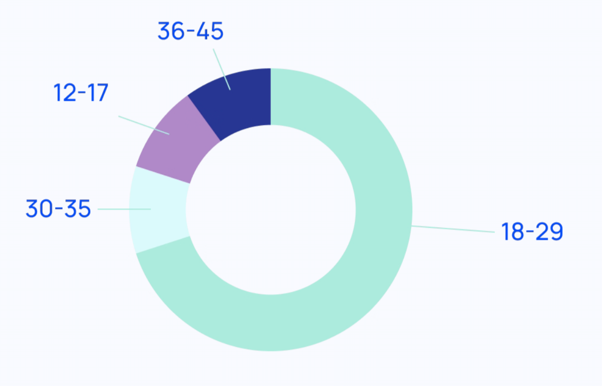
I conducted 6 interviews in total, most of them were college students and young professionals, they were between 18-29
User Journey Map
Feedback from the users:
Main Takeaways
Synthesis of Product Findings
UI
• Change the overall color palette, make it more vivd, playful and engaging.
• Change the bottom navigation buttons, make them more user friendly
Timer page
• Change the title to award timer to give user an idea it is the timer for the award
• Get rid of the play button, change it to start timer and add a save for later button instead
Task page
• Add more tags in the task, think about a way to have enough space to write and add them
Activities page
• Change the title to award timer to give user an idea it is the timer for the award
• Show a line chart for the weekly task and pie chart for the daily task
04. High-Fidelity Designs
Branding and Visual System
logo
color palette
Final Scenarios
Why I made these changes?
1. Customized Award
Based off what the folks said, I do realize the importance of this feature, in which you can customize your own tasks, which gives the users more freedom.
2. Date Setting
This is a very crucial function in which you can save the due date of your task, that can remind you when is your deadline on your task.
3.Priority Levels
I made this on my own, because I think this feature can help users to focus on their most urgent tasks first and then finish the rest of their tasks.
4. Activities
This is a good place where the users can keep on track of how many tasks they have done in a day/week, to make the users have a good habit to keep track of their habits.
05. Learnings & Next Steps
Key Learnings:
Sometimes the best solutions are not the most structured ones
Always appreciate feedback, even if it’s negative.
Usability testing is always the key
It’s only possible to start solving a problem once you’ve realized that the problem exists.
Next Steps:
Make more small features in the activities page, maybe a progress feature which would make users see their progress through using this app


