Venmo Redesign
Timeline
Fall 2021 / 6 weeks
Role
Ideation, User Research, User Flows, Sketching, Wire-framing, User Interface, Interaction Design, Prototyping, information Architecture
Overview
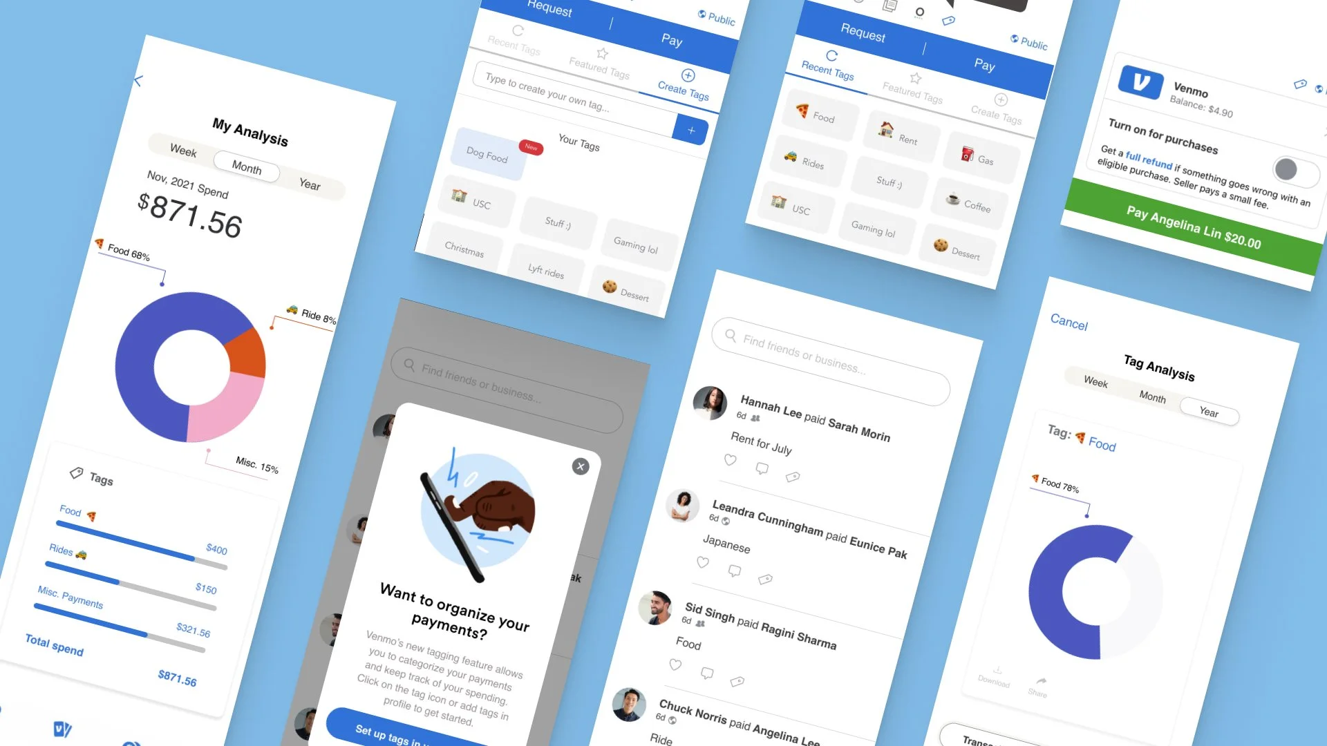
Adding a couple of new features into Venmo, redesigned the Venmo app.
Prototypes↗
Process
Discovery & ideation
Adjacent industry audit
Sketches & Low fidelity prototype
Usability Testing
Feature Introduction
High-Fidelity
Future Steps
01. Discovery & ideations
What is Venmo?
Venmo is the leading P2P payment platform in the U.S. It lets friends transfer money to each other and see payments others are making on the app’s social feed. Recently, Venmo expanded to be more than just a way to pay friends, and wanted their brand to evolve and match their growing platform.
Why am I doing this?
Venmo’s unorganized payment flow.
Addressing the primary goal of the application; quick and easy online payment application
Goal
Give users efficient access to their payment history
Users are able to keep track of their spending habits
02. Adjacent industry audit
1. Paypal
PROS:
Paying bills is centralized in one place
Credit card reward system
CONS:
While it’s free to send money on an individual basis -businesses who are sending money are charged fees
Paypal charges a 1% transaction fee if you want instant access to your money
Account freezing issues
2. Zelle
PROS:
Fastest money-sending method (when both sender and recipient are signed up)
Compatible with hundreds of U.S. banks and credit unions
CONS:
You can’t link your account to credit card to use as payment method
You can’t send money to international bank accounts
Recipients must sign up for Zelle to receive money (if the recipient doesn’t enroll within 14 days, the payment will expire,
and the funds will be returned to your account)
3. Apple Pay
PROS:
No need to carry your wallet as it carries multiple of your cards
Seamless integration on Apple products that requires no downloading- (iPhone)
Manages gift cards, movie tickets, boarding passes, and more
High-reward credit card option
CONS:
Only works with Apple devices
No online shopping support
Lose your phone, lose your wallet
Incompatible with store credit cards
So what?
We noticed that none of the apps marketed an option to organize payments.
Response
We decided to focus on the category aspect of Venmo to help user’s organize and speed up their transactions.
03. Sketches & Low fidelity prototype
Payment Screen
Tag Analysis
04. Usability Testing
Be intentional about the tags showcased in feature
Access to tags in profile settings
Ability to create tag, view popular tags, & recent tags when paying on Venmo
Move away from bar graphs
How can this be more tax friendly to educate the youth?
05. Feature Introduction
Tag Feature
How we picked our featured tags/categories
We decided to combine both Venmo’s popular payments and small business tax deductions. We moved away from taxes a little bit once we found that Venmo’s business profile allowed users to organize their payments so we didn’t really need to recreate it if it already exists on the app. This is a happy medium.
Payment Flow
Tabs menu allows users to go in between recent, featured, and create/their own tags all on one screen
Payments with tags will later show up with a notification highlighted in blue
Settings
Users see number of payments using current tags
Users see existing tags
Users can delete tags
Users can create a new tag
Tag Analysis
Users can see tag spend by week, month, and year
See tag spends against each other
Download tag spend history
06. High Fidelity
07. Future Steps
If we had time, we would have done more usability testing on Venmo and our design
Increase our testing user base from 6 to 10 since we think that would allow us to notice more improvements and behaviors from users with different demographics with respect to users.
Work with an account or company like H&R to understand the best way to educate young users about taxes through categories


