Tutor Orial Redesign
Web Prototype↗
Timeline
Fall 2021 / 8 weeks
Role
User Research, UX Design, Visual Design
Overview
Tutor Orial is a new tutor agency for high school and college aged students that specializes in finding fun and friendly tutors that help students learn.
Problem
They launched their online flow about a year ago and have very low completion rates. They have gotten a lot of complaints and bad social media reviews about how confusing the process is. The business is struggling and many tutors want to leave because they are not seeing enough clients.
What we know so far:
Tutor Orial did market research before creating the online flow, they know there is excitement about the service, they just haven’t figured out how to create a sign up flow.
They have poor conversion, specifically in the main body of the form and the scheduling screen
They tutors they hire get great reviews but the online flow does not, they don’t think the experience represents their brand
Goal
To help them to redesign a better flow of user experience.
To deliver a personalized and intuitive user experience
Process
Problem Discovery
Design & ideation
Usability testing
High-Fidelity Designs
Learnings & Next Steps
01. Problem Discovery
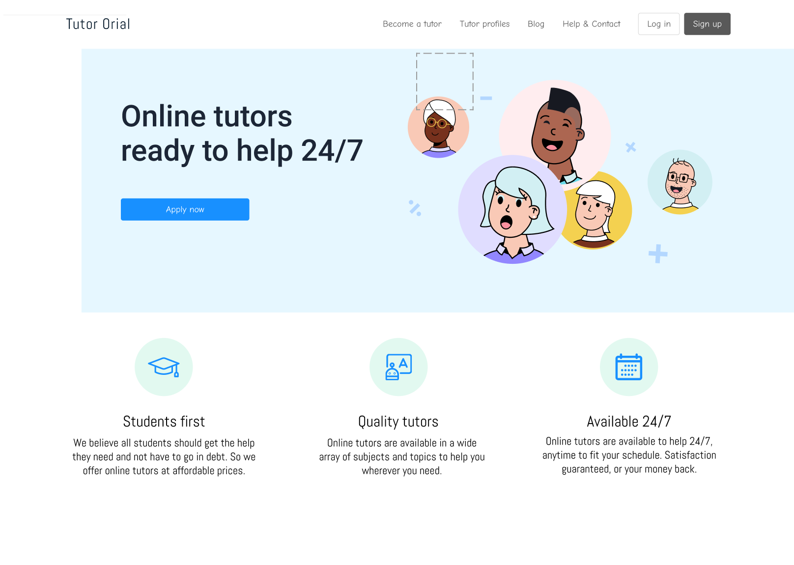
Original Website Design:
Existing Problems
The sign-up process does not follow a logical order
The user experience is confusing and there is no unified structure
Analytics show users have trouble doing what they need and don’t stick around
Low visibility of system status
Confusing and cluttered UI
02. Ideation & Wire-framing
Sketches
The very first part I sketched some ideas that I think those may improve the user flow.
Added sign-up flow
Changed the wording of the flow
Added the review part under the tutor profile
Enhance transparency of the tutor and the service provided by tutor biographies
Flow 1 & Flow 2
03. Usability testing & iterations
I had 4 interviews in total, those people were teenagers, college students, and graduate students. Some of the key insights are:
Differentiate the button of back and confirm
Change the location from map to search option
Sign up- maybe no username, name instead
Tutor page add filter/hourly rate
04. High-Fidelity Designs
05. Learnings & Next Steps
Learnings
Identifying and understanding the problem
Always establish metrics to measure goals, progress, and success before starting
Always appreciate feedback, even if it’s negative
Be open-minded and don't be attached to your idea too much
Next Steps
More filters (Languages, education)
Better branding and style guide to make it more consistence
Better flows and more rounds of user testing
Interview more people


